

 Subscribe to RSS feed
Category
- Help & Advice (41)
- News (24)
- How to (17)
- Products (15)
- Advice (14)
- Case studies (11)
- wallpaper (9)
- Colour (5)
- Community (5)
- FAQ (4)
- inspiration (4)
- New Products (3)
- Paint (3)
- Business (2)
- COTY (2)
- Events (2)
- Product (2)
- skills (2)
- Advise (1)
- Buying Guide (1)
- Colour of the Year (1)
- Colours (1)
- Customer Information (1)
- FAQs (1)
- Inspirations (1)
- Interview (1)
- New Range (1)
- Paint Application (1)
- Sustainability (1)
Tags
- Colour of the Year 2018 (5)
- wallpaper (5)
- changing rooms (3)
- Dulux Heritage (3)
- Sumup card reader (3)
- colour match (2)
- Colour of the year 2022 (2)
- Rollers (2)
- Bright Skies (2)
- Colour of the year 2023 (2)
- community (2)
- Dulux Academy (2)
- How to Repair Walls (2)
- Hamilton (1)
- Application (1)
- apply paint (1)
- Best card machine for small business (1)
- Best mobile card reader for small business (1)
- brushes (1)
- business (1)
- Business Failure (1)
- Card machine for small business (1)
- Card payment machine (1)
- Colour Palettes (1)
- colour services (1)
- Colour Trends 2022 (1)
- decorating (1)
- decorator (1)
- dulux heritage (1)
- Dulux Heritage Colours (1)
- Dulux Heritage Eggshell (1)
- featuring product recommendations and expert tips. (1)
- Home Colour Ideas (1)
- Home Office Ideas (1)
- Interior Designer Palette (1)
- Mobile card reader (1)
- Natural Light Colour (1)
- Portable card payment machine (1)
- Portable card readers (1)
- Portable card readers for small business (1)
- Refresh your home (1)
- Room Colour Ideas (1)
- Soffits and Guttering (1)
- Sumup card reader (1)
- Tastemakers (1)
- Tools (1)
- trim paint (1)
- Warm Natural Colours (1)
- woodwork painting (1)
- A Decorator’s Guide to Painting Fascia (1)
- A Guide to Painting New Builds (1)
- Apprentice (1)
- Brushes (1)
- Business (1)
- Carbon Trust (1)
- charity (1)
- COTY (1)
- Cycle Ride (1)
- Diamond Eggshell (1)
- Diamond Glaze Varnish (1)
- Diamond High Performance Eggshell (1)
- Diamond Matt (1)
- dulux decorator centre (1)
- Dulux Trade Diamond Range (1)
- Dulux Trade Paint Expert (1)
- Dustless Sander Buying Guide (1)
- Fund raising (1)
- GDPR (1)
- Heritage (1)
- How to Choose the Right Sandpaper for Walls (1)
- How to Hang Lining Paper (1)
- How to Limewash Walls (1)
- How to Maintain and Protect Garden Fences (1)
- How to Paint a Fireplace (1)
- How to Paint Over Mould and Damp (1)
- How to Paint Over Water Stains (1)
- How to Paint Patio Slabs (1)
- How to Remove Artex from Ceilings (1)
- How to Remove Paint Stains (1)
- How to Remove Wallpaper (1)
- How to Wallpaper Corners (1)
- Josh Johnson (1)
- Kitchen Cabinets (1)
- Kitchen Paint Guide (1)
- Learn more about waterproof paint in our comprehensive guide (1)
- Lincoln College (1)
- London cycle ride (1)
- London Revolution (1)
- Mould; Social Housing (1)
- news (1)
- paint brush (1)
- Paint can recycling (1)
- Sandycroft (1)
- Satin Varnish (1)
- Spray Machines (1)
- starting up (1)
- Sumup (1)
- Sustainability (1)
- The Benefits of Spray Painting (1)
- The Different Types of Brushes for Decorating (1)
- The Ultimate Guide to Painters’ Workwear and PPE (1)
- Tips for Painting a Radiator (1)
- Tips for Wallpapering Bathrooms (1)
- Water based paint (1)
- water based varnish (1)
- we love Manchester (1)
Archive
Author
4 Spring/Summer Colour Schemes & Colour Trends
Dulux Heritage colour trends for 2021: 4 beautiful spring-summer colour schemes
With spring well underway, and summer on the horizon, now’s the perfect time to redecorate your home. This year, positivity is key. Things are looking a little more hopeful and cheerful for everyone, and that same feeling is being echoed throughout people’s homes.
If you’re planning a seasonal refresh, or want to inject some joy into your home, we’ve rounded up the four 2021 colour trends setting the tone for spring/summer.
Alongside each trend, we’ve suggested colours from the Dulux Heritage palette. While Heritage colours are inspired by the past, each shade has been refined to meet the demands of modern homes. Every tin is formulated from the finest ingredients to give you a rich, durable finish that stands the test of time.
You can sample any of the spring or summer colour schemes in this article by ordering a Dulux Heritage Tester.
Make a splash with warm corals
Warm corals are a spring and summer colour trend to watch every season. These pink-orange colours are bursting with energy and optimism, and are perfect if you want to make a bold statement in your home. For this bedroom, we used Coral Pink as an impactful ¾ feature wall – a key decorating trend right now. As you can see, it’s an eye catching and vivacious pink, but you can dial it down a notch by pairing it with a more muted shade. Here we painted the top ¼ of the wall in Dusted Heather to give the room a warm Mediterranean vibe.
If you wanted to tie the room together, think about adding another colour flourish. If you look closely, you can see we’ve painted an arch around the doorframe – another decorating trend we’re loving! – this time in Wild Blackberry.

Keep calm with blues and greens
There’s no denying the calming effect blues and greens can have on a home. Certain paint colours naturally make us feel at ease, others can go as far as reducing stress and anxiety. Maritime Teal is a deep, relaxing blue-green that connects you to nature. Use it in a blue colour scheme to create a wistful feeling of open skies and calm seas. Then layer the room with hints of spring colours, such as pinks and neutrals, for an idyllic ambiance.
Other peaceful paint colours from the Heritage range include Stone Green, a mid grey/green that has a natural connection to materials such as granite and marble. Or Rosemary Leaf, a restful, muted blue/green that combines the therapeutic qualities of the two hues in one beautiful, calming shade for the perfect green colour scheme.
You can pair greens and teals together to create a beautifully balanced blue/green colour scheme. Or, you can make these nature-inspired shades the hero, teaming with a simple neutral like Swedish White for a clean, classic look.

Think pink when refreshing your home
Floral pinks are having a moment right now. They’re a sophisticated, understated way to refresh your space. Take Heritage Potters Pink for example, a pale petal pink, which encapsulates the fragility of Edwardian cottage garden blooms like the fragrant peony. It’s quite simply a breath of fresh air, something we’re all craving. Or there’s DH Blossom, a dusky mid pink with a slight yellow undertone. This warm pastel has a genteel and mature presence, and will cheer up any space.
Try it as a feature wall, but maybe go one step further as we have below. Simply run the feature wall up to the ceiling, then across it a short way. It gives you a canopy effect, mimicking the look of a four-poster bed... with paint!

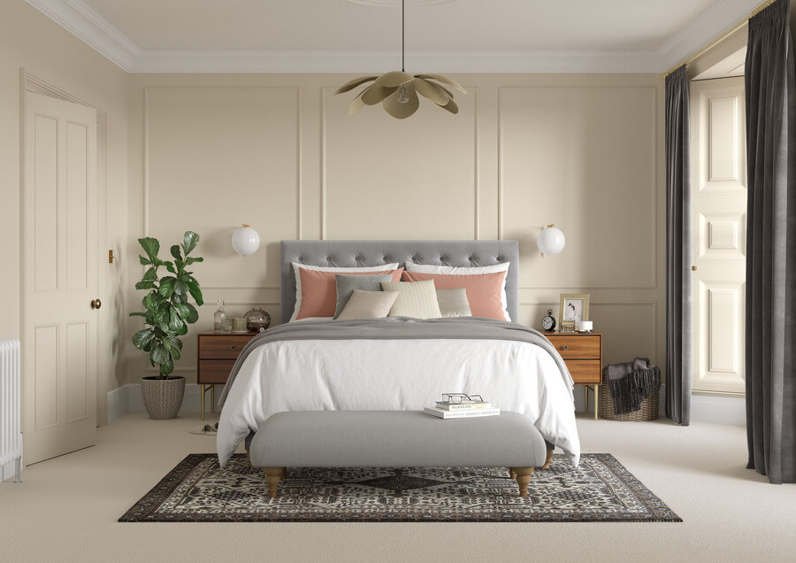
Go back to basics with neutrals
Your home should be your happy place. A neutral colour scheme lends itself perfectly to this idea. Earthy, natural shades are easy to live with and can lift the mood of any room. When it comes to styling, they work beautifully in both modern and traditional spaces. We used Raw Cashmere on the wall panelling in this bedroom to create a sense of quiet relaxation. And went for Pebble Grey in the dining room, as it’s a wonderfully warm taupe that’s ideal for a cosy, intimate setting.
Pale neutrals allow the walls to melt away, making the perfect backdrop for your furniture and accessories to take centre-stage.

Looking for more timeless spring-summer colour schemes? Check out the complete Heritage colour palette here. Or, get inspired by real Heritage homes on our Instagram.